The growth of “click and collect” and what that means for building product brand websites
The last year has changed virtually everything. From new ways of working. To remote learning. And how we buy products. Importantly, there’s a clear trend towards — Click and Collect — a hybrid e-commerce model in which audiences purchase or select items online and then pick them up at curbside.
Audiences gravitating toward click and collect
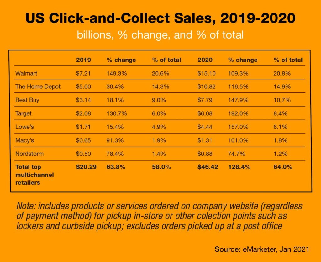
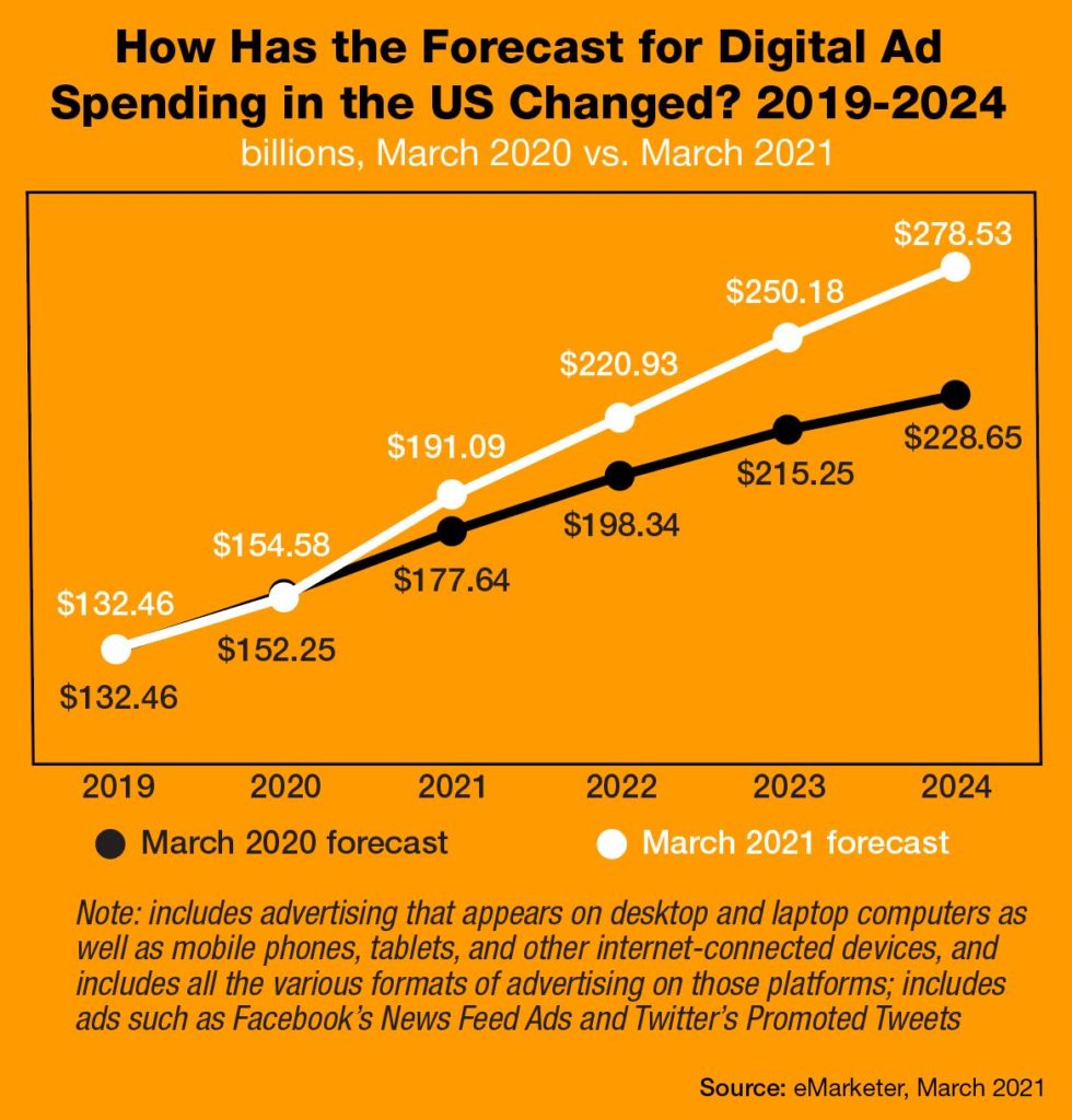
And it’s not just consumers who are adopting this trend. Contractors are increasingly embracing the opportunity for increased efficiency. Consider the following analysis for retail sales and earnings statistics for the U.S.’s largest in-store/collection points. And how the forecast for digital ad spending in the US has changed.
As we look at the year-over-year numbers for The Home Depot and Lowe’s, an interesting picture begins to emerge for the building products industry. In 2020, The Home Depot increased its click and collect sales by 116.5% while Lowe’s enjoyed an impressive 157% increase. And, by all accounts, that growth is expected to continue post-pandemic. It’s not a big surprise that home improvement retailers were leaders in click and collect… considering the size and weight for a number of their products. And the fact that purchasers — including both contractors and repair/remodeling service providers — typically need to get these products to the jobsite, as soon as possible.


For this click and collect opportunity to work effectively, distribution must ensure that adequate quantities of building product brands are in inventory. And that a strong logistics infrastructure is in place… to help arrange for convenient pick-up. Brands also must dedicate their websites to be user-friendly. And as easy to navigate as possible… to deliver a great customer experience.
You might be saying, “My building product brand doesn’t sell its products via our website.”
Yes, but that age-old argument is quickly losing relevance. All brands — whether selling direct to customer or through a multi-step business-to-business model — can benefit from assessing their current website to make sure it is keeping pace with the latest expectations for navigation, design and functionality.
Is your website in need of a refresh?
Years ago, it was enough that a company had a website… for many of the same reasons that each salesperson carried a business card. In 2021, websites perform functions that were unimaginable just a few years ago.
Think about it. In 2001, when airplane tickets first became available for purchase online… the concept was considered revolutionary. No need for a travel agent? Of course, after the purchase, the airline would ship a physical ticket to the purchaser… which then had to be presented at the airport. It all sounds pretty archaic now. After all, when was the last time you actually saw an airline ticket? But it was a big deal at the time. And created a monumental shift in thinking that continues to evolve in virtually every path to purchase.
If your website hasn’t been updated recently, it’s not going to behave in ways your current customers expect it to. In fact, a dated site and weak digital strategy can make your brand appear out of touch. And it can be difficult to overcome that perception… regardless of how great your products perform. As a result, your brand could be missing out on valuable sales. And top-of-mind consideration.
The good news is there’s no moment like the present. At this important inflection point in our lives… it’s time to consider your current digital footprint and its user experience.
To help, we put together a list of nine questions all building product brand marketers should ask when evaluating their websites today.
Does your navigation make sense?
Can site visitors easily find the information they are seeking? Make sure your navigation is logical and intuitive. And doesn’t require visitors to work too hard — or wade through multiple layers of menus — to find what they’re looking for. Users who don’t have a good experience when visiting a site are unlikely to visit again.
Is your website mobile-friendly?
Keep in mind that more than half of all web traffic happens while your audience is on the move. As such, the most effective web experiences are optimized for viewing on mobile devices. Maybe you experience your brand most often from your desktop or laptop. So, check out your website (again) — this time, from a mobile phone. Do you like what you see for every aspect of the “journey”?
Are there technical issues or broken links?
View your website and campaign landing pages on a variety of different browsers and note how everything behaves. Click on all links. And make sure they go where they’re intended to land. Do links lead to the wrong webpage — or worse yet, an empty page? If so, visitors — i.e., potential customers — are likely to become frustrated and leave your site prematurely.
Is your site secure?
An encrypted site (HTTPS) is important even if your brand doesn’t engage in ecommerce. In addition to securing financial and browser history data, an encrypted site helps to prevent third party breaches. And provides added peace of mind for website visitors.
Is your website fast enough?
If your website takes too long to load, you are losing traffic… and potentially lots of it. People pay for high-speed connections. As such, they expect websites to behave accordingly. A number of available tools will allow your team to perform speed tests to quickly evaluate your site’s page loading speed.
Is your content high quality?
Is the content on your site clear, concise… and grammatically correct? Keep in mind that users don’t read websites — so much as skim them — so make sure your headlines and subheads clearly explain what readers can expect to see on the webpage… and are compelling. Ensure your marketing is fully aligned with sales on the type of content that best informs both customers and prospects.
Do the visuals elevate your brand’s image?
Do your photos look as good as they could? Make sure all images are high res and well lit. To optimize visual appeal, include a mix of installed, style shots as well as product silhouettes. Yes, catalog-formatted product images that are set against a white background and close-up details are important. Just remember that visitors to your site want to see your products in real-life settings too.
Does your site have clear calls to action?
Are you actively encouraging visitors to your brand’s site to take the next steps? Ensure that your calls-to-action are clearly visible. And truly engaging. Calls-to-action should be included on multiple pages within your site… to help ensure that you capture leads. And, for growing your prospect database while contributing to robust marketing automation/CRM.
Are you targeting the right keywords?
SEO is more important today than it’s ever been. No matter how great your website is, if your target audiences can’t find your brand… you’re missing out on valuable opportunities. Make sure you research, and incorporate, high performing keywords throughout your site content. Consider investing in a next-gen, pay-per-click program to drive more traffic to your site.
Looking for ways to elevate your website, digital design, and creating a better customer experience… that will help your brand stand out from the competition? K&A can help. Send an email to Steve Kleber at sk@kleberandassociates.com to learn more.


